
Strategic Vision
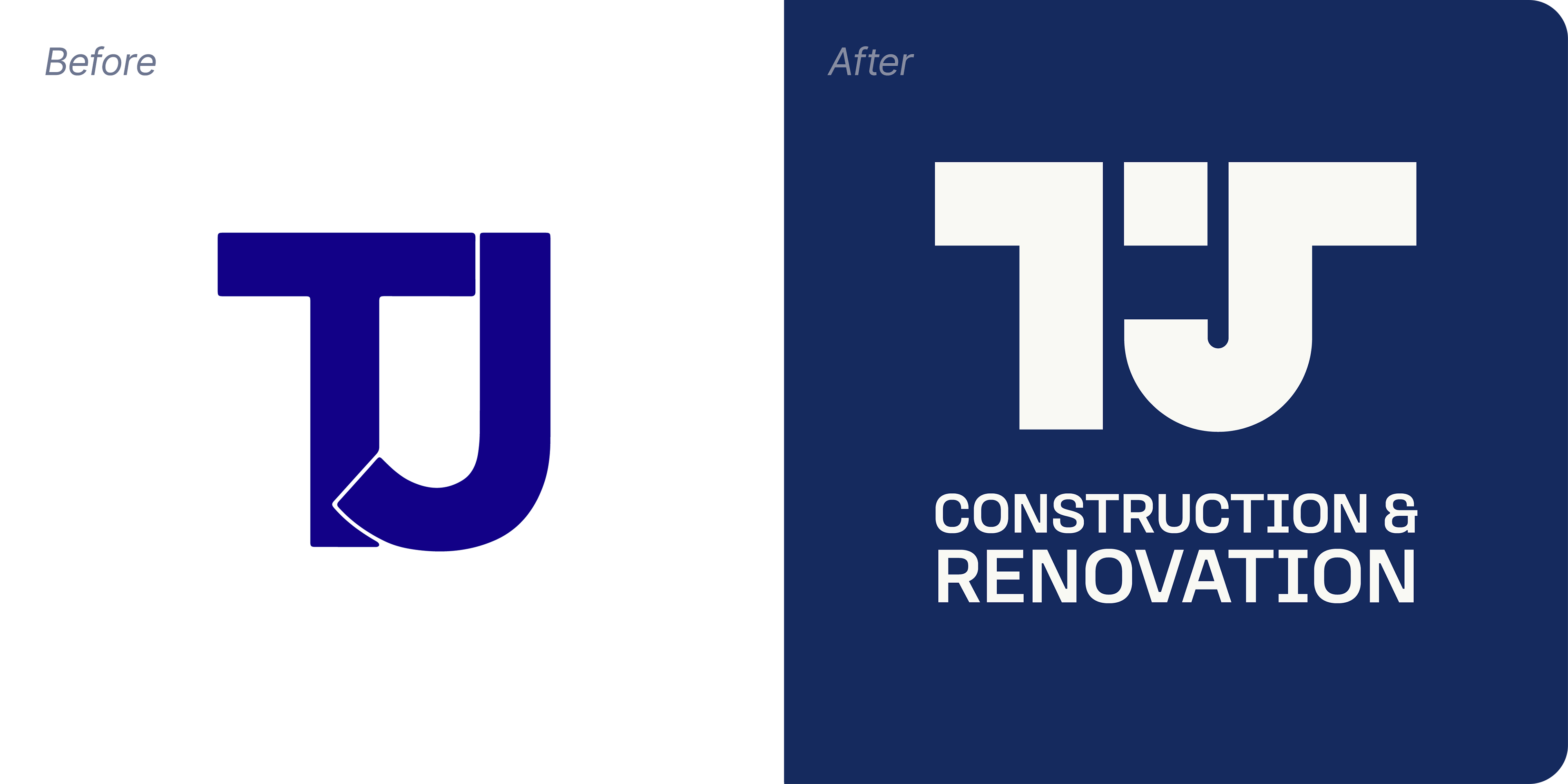
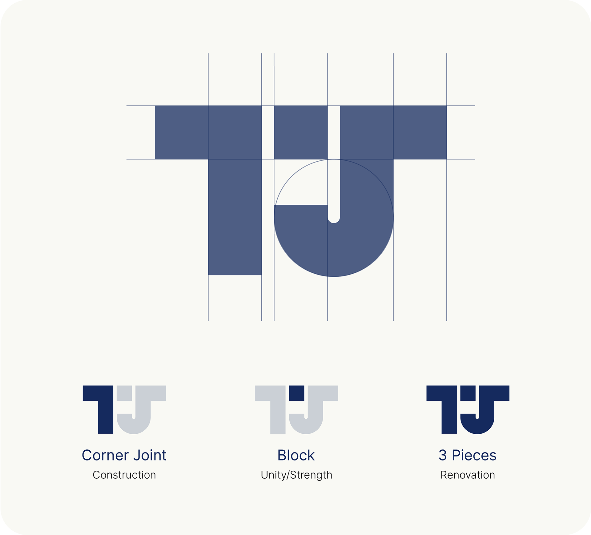
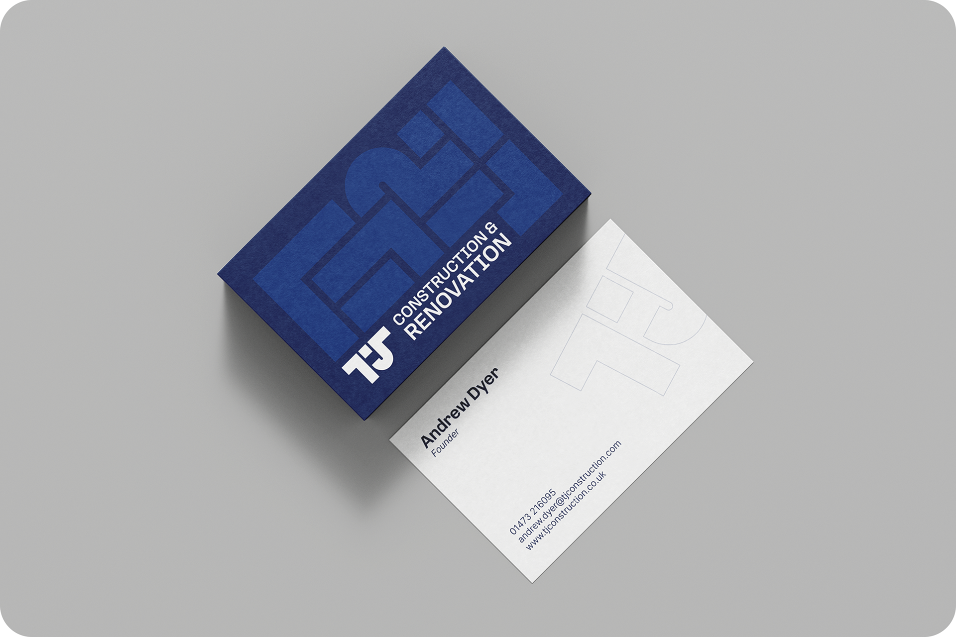
The redesign of TJ Construction’s logo focused on retaining the simplicity and clarity of the original while infusing it with a sense of strength and architectural integrity. The new logo maintains the blocky nature of the "T" and "J" but introduces sharper angles and more defined lines, replacing the softer, rounded corners. This subtle yet impactful change enhances the perception of precision and strength, aligning the visual identity more closely with the company’s expertise in construction.

Type & Colour
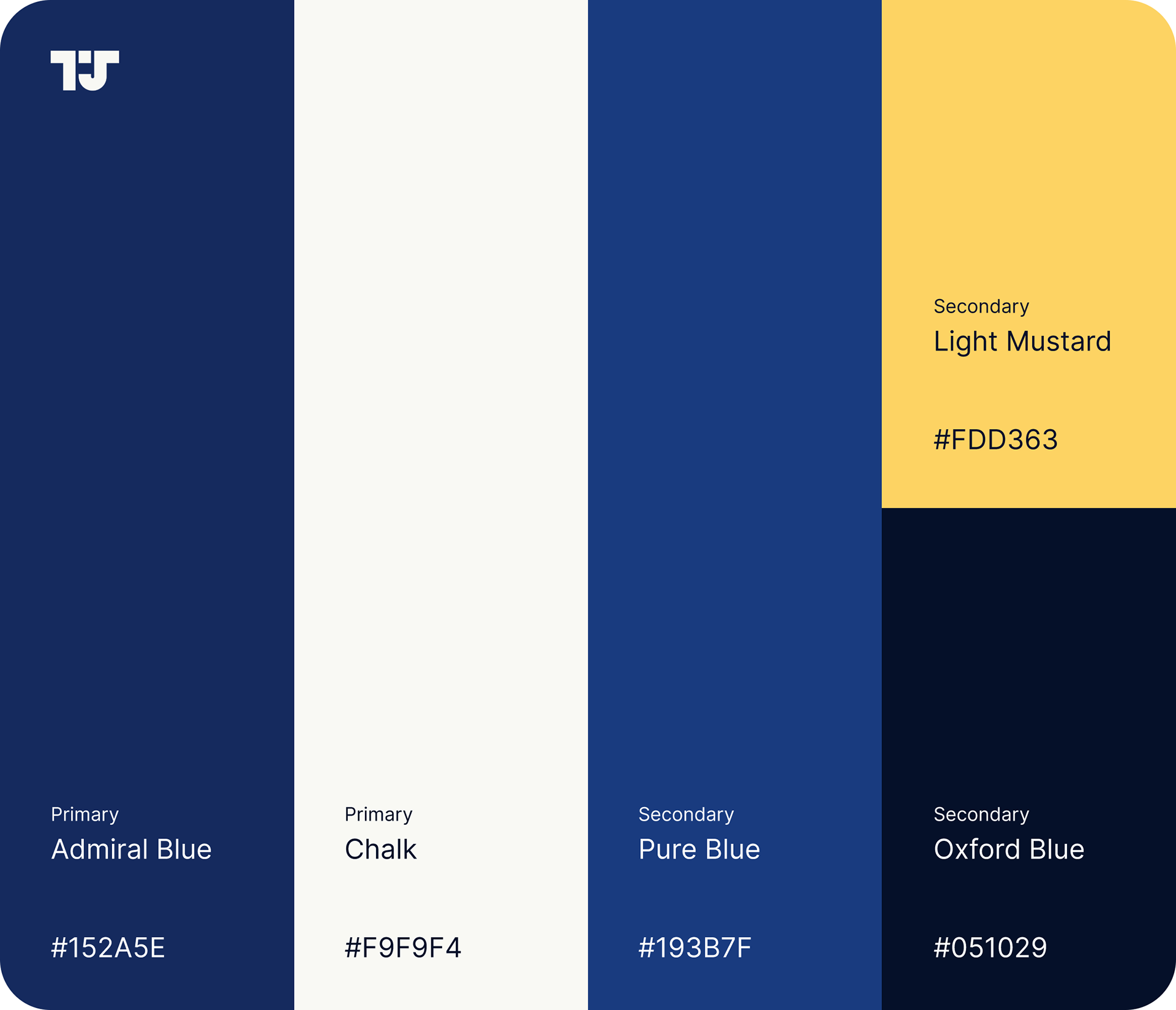
In addition to the logo redesign, the typography and colour palette were carefully curated to enhance the brand’s new identity. The choice of Loos as the primary typeface reflects the same geometric precision found in the logo. Its modern and versatile nature makes it an ideal match.
A deep, authoritative blue was chosen as the primary colour, symbolising trust and professionalism. To prevent the palette from feeling too cold or corporate, complementary earth tones were introduced, adding warmth and balance.

