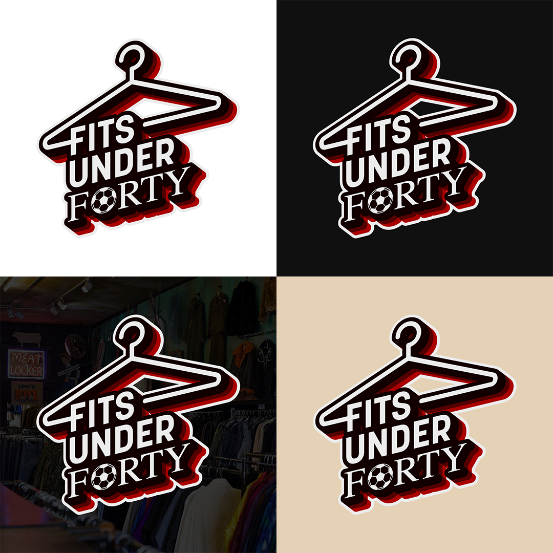
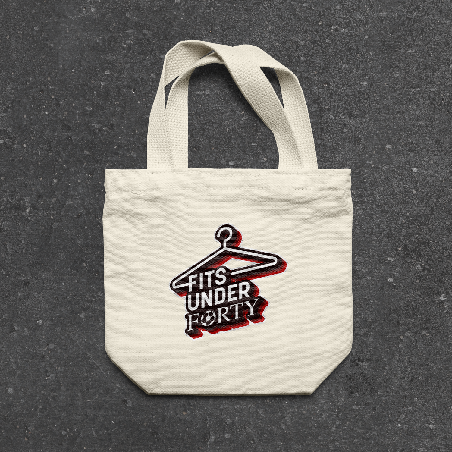
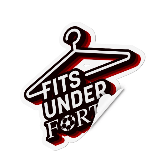
The Concept
The visual identity for Fits Under Forty blends sporty elements with a retro twist, reflecting both the athletic nature of the participants and the vintage theme of the clothing. The logo features a bold, modern hanger graphic, representing the experience of sifting through racks of clothing in vintage and thrift stores to discover unique pieces.
Type and Colour
The words Fits Under Forty are displayed using a mix of serif and sans serif typefaces, highlighting the contrast between the modern fashion styles of footballers and the vintage clothing they will be selecting from. This thoughtful design effectively captures the essence of the series—where contemporary athleticism meets the timeless charm of vintage fashion.